import pandas as pd
import numpy as np
import panel as pn
pn.extension('tabulator')

import hvplot.pandasOnline Sales Data Dashboard
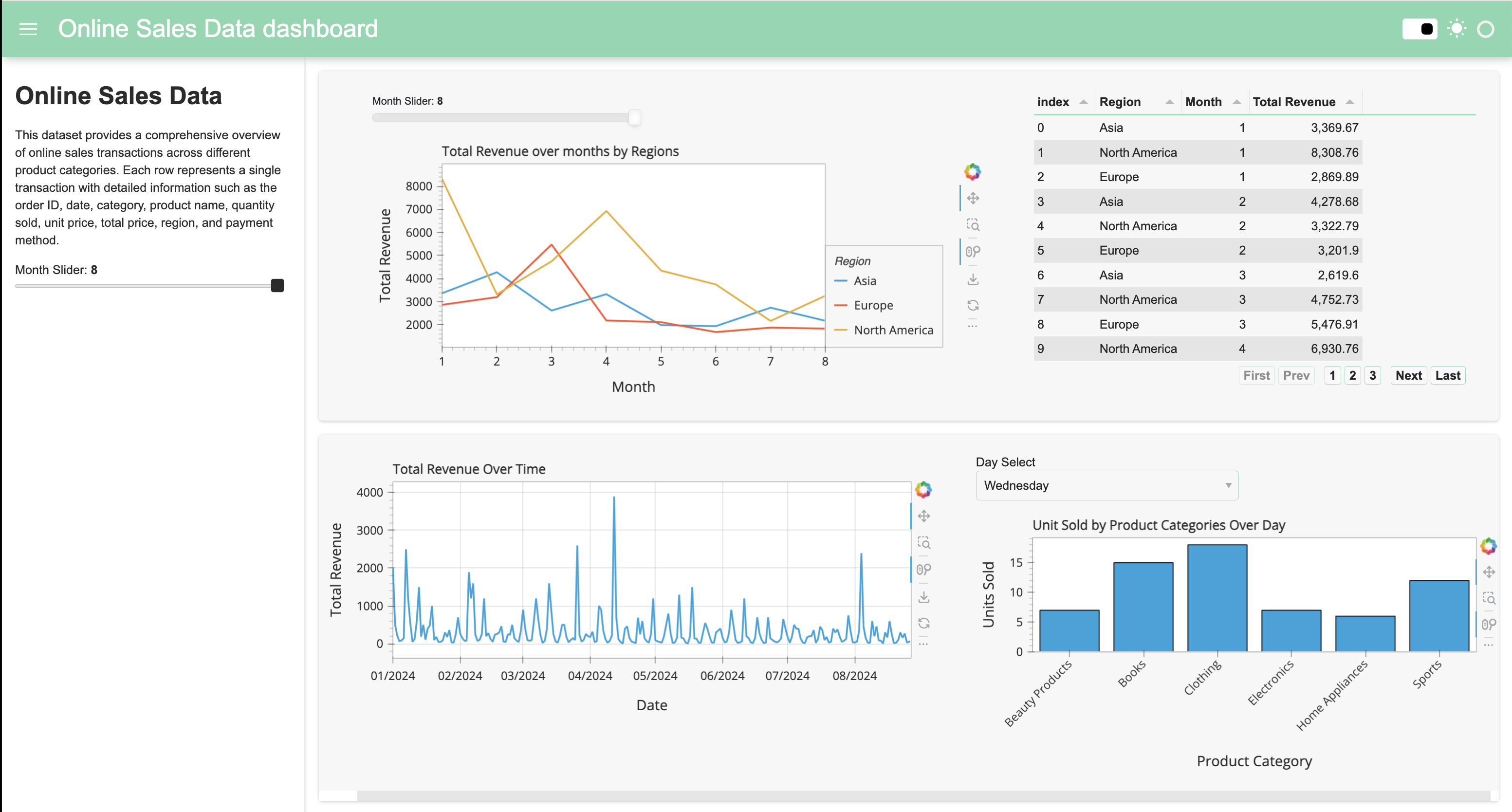
This is a interaction dashboard using Panel in Python. This is the result:
Below is step by step how I create this dashboad. To serve the dashboard locally, clone this repo: https://github.com/rsm-dtt006/Interaction-Dashboard and use the command:
panel serve interactive_dashboard.ipynbdf = pd.read_csv('Online Sales Data.csv')Some minor data preprocessing
df['Date'] = pd.to_datetime(df['Date'])  # Ensure the Date column is in datetime format
df['Month'] = df['Date'].dt.month  # Extract the month
df['Day Name'] = df['Date'].dt.strftime('%A')
df| Transaction ID | Date | Product Category | Product Name | Units Sold | Unit Price | Total Revenue | Region | Payment Method | Month | Day Name | |
|---|---|---|---|---|---|---|---|---|---|---|---|
| 0 | 10001 | 2024-01-01 | Electronics | iPhone 14 Pro | 2 | 999.99 | 1999.98 | North America | Credit Card | 1 | Monday |
| 1 | 10002 | 2024-01-02 | Home Appliances | Dyson V11 Vacuum | 1 | 499.99 | 499.99 | Europe | PayPal | 1 | Tuesday |
| 2 | 10003 | 2024-01-03 | Clothing | Levi's 501 Jeans | 3 | 69.99 | 209.97 | Asia | Debit Card | 1 | Wednesday |
| 3 | 10004 | 2024-01-04 | Books | The Da Vinci Code | 4 | 15.99 | 63.96 | North America | Credit Card | 1 | Thursday |
| 4 | 10005 | 2024-01-05 | Beauty Products | Neutrogena Skincare Set | 1 | 89.99 | 89.99 | Europe | PayPal | 1 | Friday |
| ... | ... | ... | ... | ... | ... | ... | ... | ... | ... | ... | ... |
| 235 | 10236 | 2024-08-23 | Home Appliances | Nespresso Vertuo Next Coffee and Espresso Maker | 1 | 159.99 | 159.99 | Europe | PayPal | 8 | Friday |
| 236 | 10237 | 2024-08-24 | Clothing | Nike Air Force 1 Sneakers | 3 | 90.00 | 270.00 | Asia | Debit Card | 8 | Saturday |
| 237 | 10238 | 2024-08-25 | Books | The Handmaid's Tale by Margaret Atwood | 3 | 10.99 | 32.97 | North America | Credit Card | 8 | Sunday |
| 238 | 10239 | 2024-08-26 | Beauty Products | Sunday Riley Luna Sleeping Night Oil | 1 | 55.00 | 55.00 | Europe | PayPal | 8 | Monday |
| 239 | 10240 | 2024-08-27 | Sports | Yeti Rambler 20 oz Tumbler | 2 | 29.99 | 59.98 | Asia | Credit Card | 8 | Tuesday |
240 rows × 11 columns
Total Sales over time by Regions
#Define Panel Widget
month_slider = pn.widgets.IntSlider(name='Month Slider', start= 1, end=8, step=1, value=8)
# Make DataFrame Pipeline Interactive
idf = df.interactive()
regions = df['Region'].unique().tolist()
regions['North America', 'Europe', 'Asia']revenue_pipeline = (
idf[
(idf.Month <= month_slider) &
(idf['Region'].isin(regions))
]
.groupby(['Region', 'Month'])['Total Revenue'].sum()
.to_frame()
.reset_index()
.sort_values(by = 'Month')
.reset_index(drop = True)
)
revenue_plot = revenue_pipeline.hvplot(x = 'Month', by = 'Region', y = 'Total Revenue', line_width = 2, title = 'Total Revenue over months by Regions')
revenue_plotTable - Total Sales Overtime by Regions
revenue_table = revenue_pipeline.pipe(pn.widgets.Tabulator, pagination='remote', page_size = 10, sizing_mode='stretch_width')
revenue_table- Total Revenue by Date
revenue_date = df.groupby('Date')['Total Revenue'].sum().hvplot(grid=True, figsize=(12, 6), title='Total Revenue Over Time', xlabel='Date', ylabel='Total Revenue')
revenue_date
WARNING:param.main: hvPlot does not have the concept of a figure, and the figsize keyword will be ignored. The size of each subplot in a layout is set individually using the width and height options.Barchart : Unit sales by Product Category
day_name = df['Day Name'].unique().tolist()
products = df['Product Category'].unique().tolist()

day_select = pn.widgets.Select(name='Day Select', options= day_name)
day_select
unit_sale_pipeline = (
idf[
(idf['Day Name'] == day_select) &
idf['Product Category'].isin(products)
]
.groupby(['Day Name', 'Product Category'])['Units Sold'].sum() # Corrected line
.to_frame()
.reset_index()
.reset_index(drop = True)
)
unit_sale_pipelineunit_plot = unit_sale_pipeline.hvplot(x = 'Product Category', y = 'Units Sold', kind = 'bar', title = 'Unit Sold by Product Categories Over Day', rot = 45)
unit_plotCreating Dashboard
template = pn.template.FastListTemplate(
    title='Online Sales Data dashboard',
    sidebar=[pn.pane.Markdown("# Online Sales Data"),
             pn.pane.Markdown("This dataset provides a comprehensive overview of online sales transactions across different product categories. Each row represents a single transaction with detailed information such as the order ID, date, category, product name, quantity sold, unit price, total price, region, and payment method."),
             month_slider
             ],
    main=[pn.Row(pn.Column(
                           revenue_plot, margin=(0,25)),
                 revenue_table.panel(width=500)),
          pn.Row(pn.Column(revenue_date, margin=(0,25)),
                 pn.Column(day_select, unit_plot))],
    accent_base_color="#88d8b0",
    header_background="#88d8b0",
)
# template.show()
template.servable();